


Lettering a comic for fun and profit
But really, only for fun

We are back with another Amazing Journey column! But before we get to that, the Blood of Atlantis issue 2 Kickstarter pre-launch page is now live! Sign up to get notified when the campaign launches next month to help us have the strongest possible start!
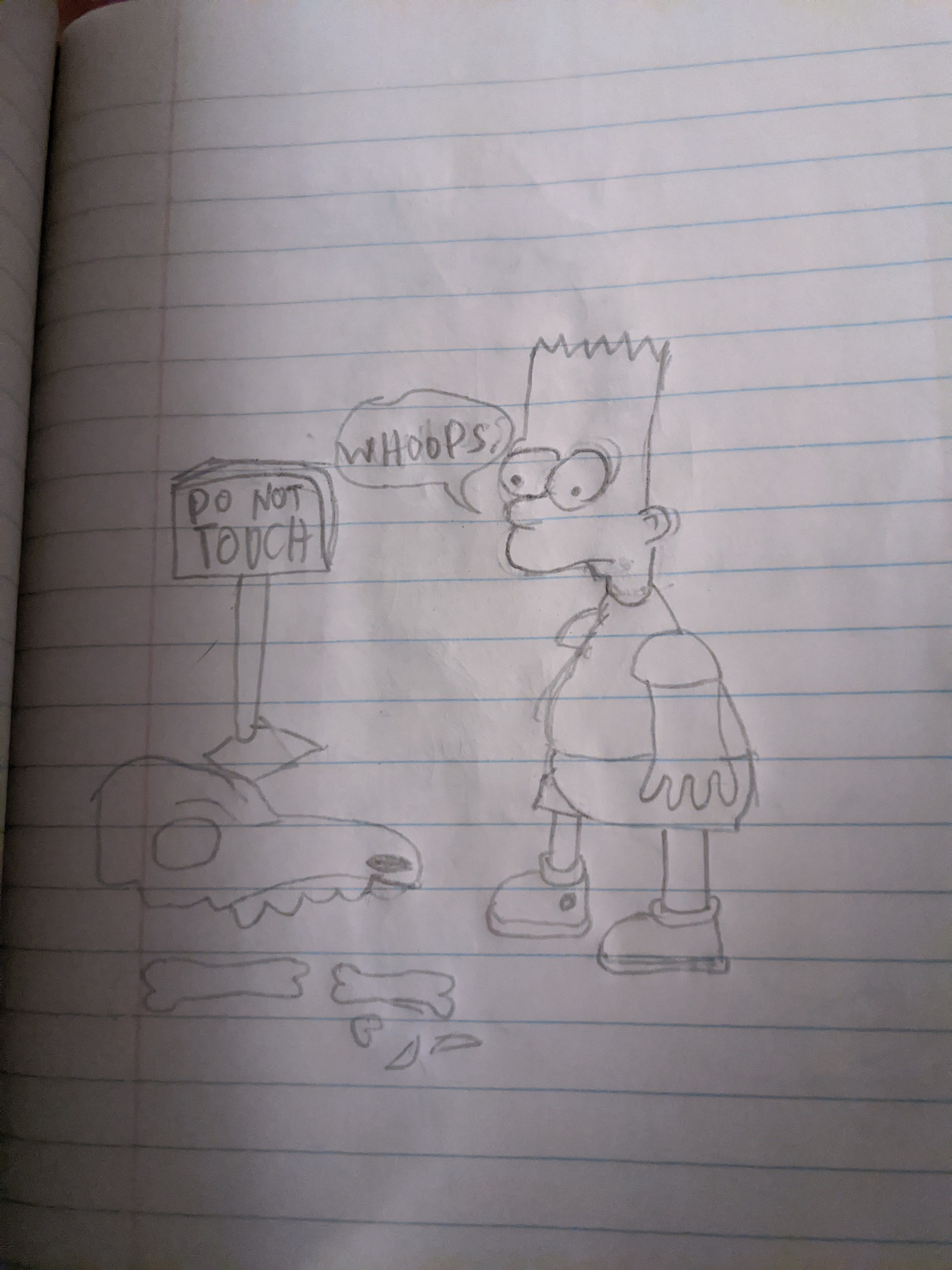
When I started reading comics in earnest in 2019, the various roles involved in bringing a story from idea to printed page were pretty foreign to me. My comic creating experience at that point was one-panel comics of Bart Simpson getting into various sorts of trouble from my middle school days:
So I was surprised to learn that many, many people were involved in creating a single-issue comic. There was the writer, obviously. But once you moved to art, it got more complicated. There could be one artist who does everything, or a separate penciller, inker, and colorist, or some combination of the three. And then there was the lettering, which was also done by a separate person.
Creating my own comic series last year let me see the process firsthand, and while I would love to up my art skills to the level of the talented professionals I’ve worked with so far, that seemed like a years-long endeavor.
So instead, as a fun exercise, I decided to see what lettering was all about, using issue two of Blood of Atlantis as my canvas.
Now, most letterers use Adobe Illustrator, which I do not have, but fortunately I found a YouTube video on how to letter in Photoshop, so off I went.
The first step in lettering a comic is picking a font. You might not have ever given this much thought, as you’re stuck with either Times New Roman or Calibri (or whatever terrible font Gmail uses) for the bulk of your professional writing.
But selecting a readable and context appropriate font is super important, and something that deserves its own separate post.
Where do you even get a comic book font? An excellent place to start is letterer Nate Piekos’s Blambot, where Nate has hundreds of fonts for sale, many of which you can download for free under an indie/small press license.
For this exercise, I picked Plot Holes:

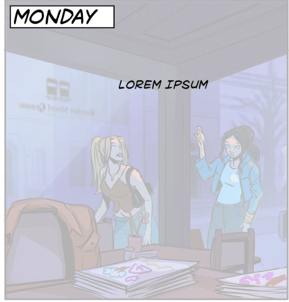
With the font installed, it was time to get cracking! I opened up the colored TIF in Photoshop and added a 70% opacity layer of white over the art. That way, the font would be more visible, but I would still be able to see its placement compared to the art underneath.
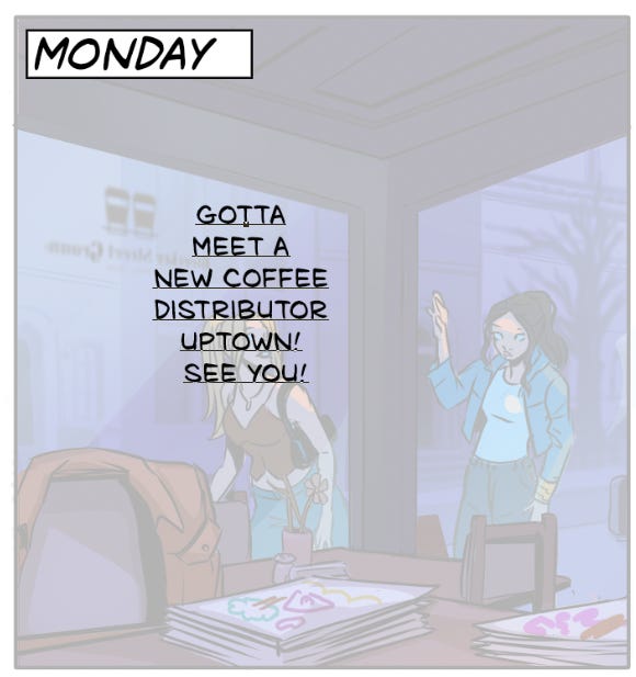
Next, it’s time to add the dialogue.1 This panel only has one dialogue line: “Gotta meet a new coffee distributor uptown! See you!” I added that straight into the panel:

After that, the dialogue needs to be fitted so a word balloon can be drawn around it. This entails figuring out how many words should go on each line and how the text as a whole should look. Should there be one word, then two, then three, etc., making a triangle shape? Or maybe that in reverse? The suggestion in the video above is to make it small-to-big-to-small. So I tried to do that. But it’s not as simple as it sounds!
Should “uptown” and “see” be on the same line? Should “meet” be on the first line? I don’t know, I’ve never done this before!
I press on to the next step, which is adding the word balloon. This is also easy, just draw a circle!

But in drawing that circle, you need to pay attention to how much white space is around the dialogue. The above attempt leaves too little space at the bottom, making the lettering look a bit squished. To fix that, I turn to the Direct Selection tool, which allows you to modify each part of the circle’s curve.

I add some more space around the edges, so now we can move on to adding the tail to the word balloon. Again, not so simple! You can freehand draw a tail (which to me sounds like a terrible idea), or use the Pen tool to add a curve to the circle. This again sounds simpler than it is. After nearly giving up, I finally figure out how to create a decent-looking tail:


Great, so now we’re done! With one panel. On one page (out of 34).

Except, not quite. Because what I haven’t told you is that our Blood of Atlantis letterer, Toben Racicot, already lettered this page. And I’ve purposefully not reviewed it, so I could try on my own and see what I came up with. But now that I’m done, it’s time to tabulate the score:


Lots to critique here. My lettering font was too big, my dialogue balloon was too big, and my tail a bit too wide. Using Toben’s lettering as a guide, I recreate (or at least try to) what he did:

Perfect! Time for me to do the rest of the issue! Ehh, not quite. While this experience was definitely educational, and I feel confident enough to create some fun graphics to help promote the Kickstarter, I will definitely be leaving the lettering to the professionals.
Speaking of, if you want to see a comic with awesome lettering and art and a great story to boot, then head on over to the Blood of Atlantis #2 Kickstarter pre-launch page to get notified when we launch next month!

Amazing Journey back issues
True believers unite (#1) | My comics origin story (#2) | Comic event series (#3) | The comics of Kickstarter (#4) | Single issues or trades? (#5) | From prose to comics (#6) | Adapting a celebrated fantasy series into a comic (#7) | Charting a career in comics (#8) | Comic book spoilers (#9) | Lessons from Kieron Gillen’s masterclass (#10) | Comics marketing 101 (#11) Designing memorable characters (#12) | The importance of comic book shops (#13) | Finding community at NYCC (#14) | Writing issue number one (#15) | Announcing Blood of Atlantis (#16) | Comics marketing 102 (#17) | Comic social media (#18) | The convention scene (#19) | Tabling at NYCC (#20)
There is also the intermediate step of picking the right font size.